Thursday, November 27, 2025

“One Stamp, Two Stunning Cards | Altenew Vellum Embossing & Watercolor Backgrounds”

 Hello crafty friends! Today I’m sharing a fun creative journey that started with a single idea… and ended up becoming two very different cards. I’m thrilled to inspire/create with you as an Altenew Ambassador for a couple of months :)


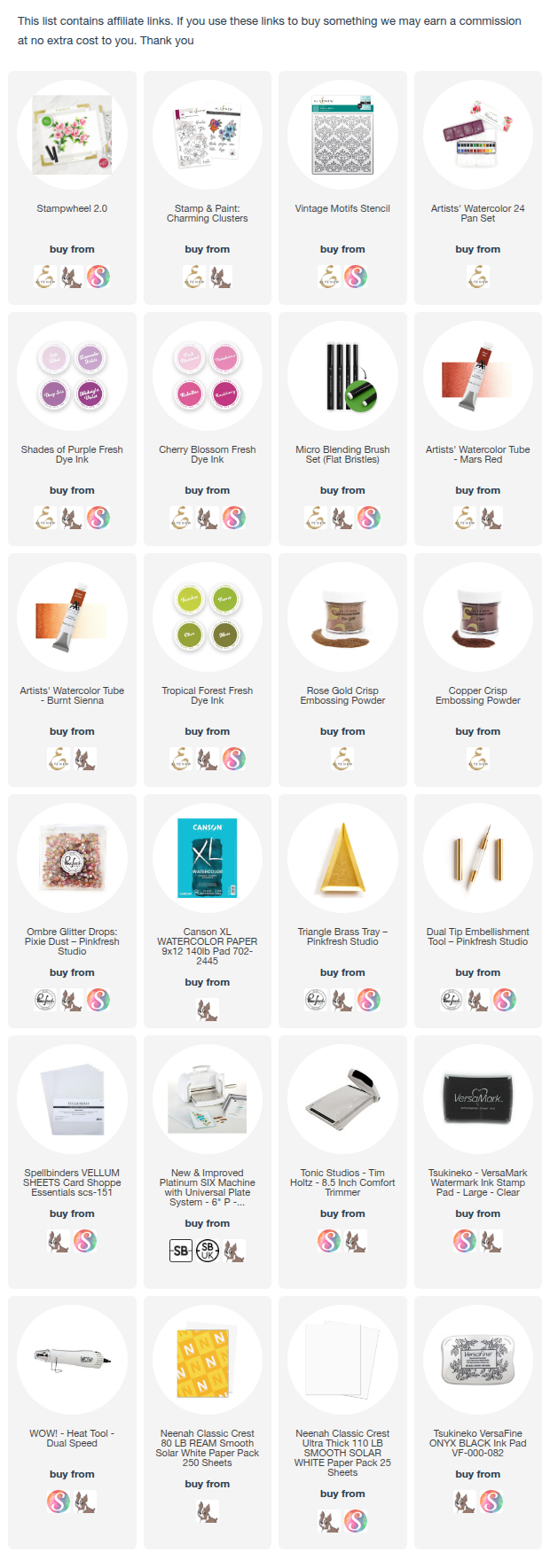
Before we start, there are black Friday offers going on and also the free US shipping and a discount for internationals (No code needed). Here is the link, if you want to take up on the offer and get your favourite products. I have added the full supply list below too. I would really appreciate it. Thank you :)


I have a process video for these cards and a 20$ giveaway on my YouTube channel 


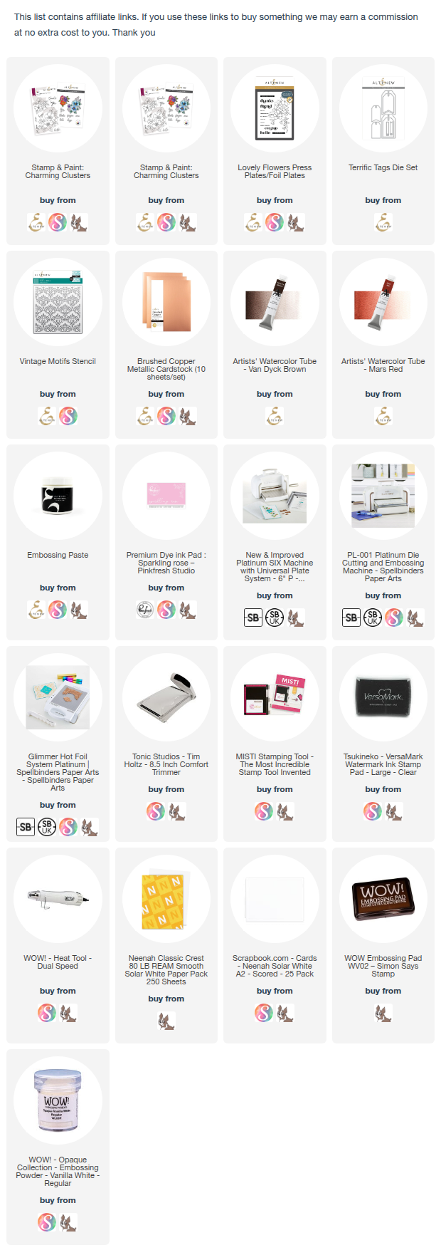
For these cards, I used the Charming Clusters stamp and die set (already on sale, if you want) from the November release. The coordinating dies include two floral clusters and six sentiment words, making it a wonderfully flexible set. I also incorporated the Vintage Motifs stencil for added texture.

The first card features a soft watercolor wash paired with delicate rose-gold heat embossing on vellum, distressed gold edges, and layered die-cuts. The look is elegant, airy, and beautifully detailed.


The second card uses the floral cluster embossed in copper, with ink-blended color on the back of the vellum, a soft pink watercolor wash, and stenciled texture in the background. This combination creates a brighter, more contemporary feel.


Both designs use the same stamp set — but the techniques completely change the final look. I love how versatile this set is, and I hope these ideas inspire you to try vellum embossing, watercolor washes, and layered die-cutting in your own projects.

I hope you got inspired. Which card do you like more? Let me know — I’d love to hear!


A process video and giveaway on my YouTube channel

Thanks for stopping by, and happy crafting!

Friday, November 14, 2025

Pinkfresh Studio “Delicate Details” Release Blog Hop

Hello crafty friends!! I am so excited to join Pinkfresh Studio "Delicate Release" bloghop. This release is versatile as always and I love it.


NEWS: Do take advantage of the Cyber Monday sale HERE and you don't wanna miss this for sure :) 


Today I decided to focus on the Bloom & Brew product suite - a beautiful mix of teapots, teacups, and detailed florals that come together easily. What I really love about this set is that, there is a stencil in the set, which covers all the images, and we can add color to the background.

I am sharing two cards, I kept both cards centered around ink blending for smooth gradients and bold contrasts, then finished each panel with different color stories to show how versatile the set can be.


All the products are linked below.

CARD 1 — Soft Garden Teapot Shaker (Bright + Airy Version)


I started by, adding color to the teapot, cup, and florals using the coordinating shades of teal, pink, and yellow.

I kept the images brighter in the center and slightly darker toward the edges for depth.


For the background, I started by ink blending a soft green backdrop using Mint and Meadow inks. Then added depth using Emerald City and Evergreen inks. Sentiment: For a special someone — offset was turquoise glitter card.


I layered and added a stitched frame to give the layout an elegance, and create the shaker element. Finally, I added the sentiment on top of the acetate window.

CARD 2 — Moody + Deep Version


The teapot and cup were colored in bright yellows and soft corals to pop against the dark backdrop.
Florals were kept bold and saturated, leaning toward reds and blues.


For a dramatic contrast background, I blended deeper tones of all the colors. I used Turquoise, Lush Forest, Evergreen and Black inks.


This shifts the mood completely — almost like an evening high-tea scene.

A dark green frame helps anchor the entire design. I used some Ombre glitter drops: Pixie Dust

Final Thoughts
Using one design set in completely different color palettes is a great way to stretch your supplies. The Bloom & Brew set lends itself naturally to both soft, cheerful tones and bold, dramatic scenes. Ink blending remains an easy and controlled way to build backgrounds that look polished without extra layers.
If you try either palette, I’d love to know which direction you choose — bright or moody!

Giveaway
Pinkfresh Studio will be giving away the full release on the Pinkfresh blog & YouTube channel.
As well as a total of TEN $50 gift cards along the hop. As usual the winners will be selected from the comments.
Pinkfresh Studio will pull the winners & post them on November 21, 2025, on their GIVEAWAY PAGE.
Don't forget to check that page & claim your prize within 2 weeks.

Here is the link to complete HOP list

CLICK TO ENTER HERE

Thank you so much for dropping by and have a wonderful weekend!

Wednesday, November 12, 2025

Altenew “For You” and “Hello” Cards – Two Looks, Same Products with few Techniques

Hi everyone!
I’m excited to share a pair of floral cards today featuring Altenew’s products — and a fun twist on how one design can look completely different with just a change in technique and color palette.


Both cards use the same floral press plate and tag die, but one celebrates soft and delicate watercolor vibrance, while the other embraces elegant simplicity and clean lines. Let’s dive in!

I have listed the products below :)

 Card 1: Watercolored Tags – Bright & Playful


For this card, I used the letterpress system with the press plate onto watercolor paper. Die-cut two tags out of it. Then, I watercolored the flowers using Altenew’s Artists’ Watercolor, mixing pinks, reds and corals for a natural petal variation.


I added embossing paste through the Vintage Motifs stencil in the background.and the two tags are slightly offset for a dimensional layered look.

I finished with a sentiment from Build-A-Garden: For You, some black twine, and a few sequins for sparkle. 

Card 2: Sleek & Minimalist Tag Design


This card shows how elegant simplicity can be! I used glimmer hot foil machine to foil on the Brushed Copper cardstock.


Then, I die-cut the tag on a black card layer for contrast and added a bold white-embossed sentiment, “hello,” to tie everything together.

A few black enamel dots add just the right touch of texture and sophistication.

Final Thoughts
I love how these two cards showcase the versatility of  the same products — from soft watercolor feel to modern graphic minimalism.
Sometimes, all you need is a shift in technique, color and finish to create a whole new mood.

Which one speaks to your style — soft and colorful or clean and elegant? I’d love to know in the comments!

Discount Code: 

To celebrate today, I have an Exclusive Discount Code for my followers!

Code name: ISHAFREE

Duration: From November 12th - 19th. at 11:59 pm EDT

Offer: FREE Crafter's Essential Micro-Tip Tweezers ($8.99 value) on every order over $79

Instructions: Add the Crafter's Essential Micro-Tip Tweezers to your cart and use the code ISHAFREE at checkout to get it for free.

Link to Use: https://altenew.com/discount/ISHAFREE?sca_ref=6333953.TchYT5DdF6q (Note: This link is integrated with the code)

Thank you for dropping by and have a wonderful day!