Showing posts with label Spellbinders. Show all posts

Thursday, June 4, 2026

Spellbinders - Whimsical Village Collection

Hello crafty friends!

Today I’m sharing two cheerful cards created with the adorable Spellbinders Whimsical Village Collection by Vicky Papaioannou. The moment I saw these whimsical tiny houses, I knew they would be perfect for creating playful scenes filled with charm, color, and a touch of storybook magic.

One of my favorite things about this collection is how easy it is to build little worlds on a card. By simply changing the colors, background, and layout, the same dies can create completely different looks and moods.
 
Card 1 – Window into a Whimsical Village


For my first card, I created a clean and simple design featuring a bright yellow cottage tucked behind tall pink blooms. To frame the scene, I die-cut an arched window opening from a white panel, creating the feeling of peeking into a magical little garden.


The background was softly ink blended in aqua tones and finished with splatters for extra texture and interest. The vibrant pink flowers and sunny yellow house stand out beautifully against the cool blue backdrop, while the black sentiment strip adds a crisp finishing touch.


I love how the dimensional window frame draws your eye directly to the tiny cottage and creates the feeling of a miniature storybook landscape.


Card 2 – A Cozy Cottage Scene


For the second card, I took a more open and playful approach. This sweet pink cottage is surrounded by oversized flowers, soft watercolor splashes, and two curious little cats sitting nearby.


The background was created with loose watercolor washes and splatters to keep the design light and whimsical. Bright yellow flowers add warmth and contrast, while the kraft card base helps ground the scene and gives it a cozy, handmade feel.


The tiny fence and cats add so much personality, making this card feel like a snapshot from a charming village garden.

Final Thoughts

The Whimsical Village Collection is such a fun collection for scene-building. Whether you prefer clean and simple designs or layered storybook scenes, these dies offer endless possibilities for creating unique cards filled with character and charm.

I especially enjoyed creating two completely different looks while using the same collection. One card feels like a peek through a magical window, while the other tells a sweet little garden story.

Thank you so much for stopping by today! I hope these cards inspire you to create your own whimsical village scenes and experiment with different color combinations and layouts.

Happy crafting and have a nice day!
Thursday, March 26, 2026

Spellbinders - Mixed Media Cards with Rosie’s Studio “Breakfast in Bed” Collection

Hello crafty friends, Today I’m sharing a set of soft, mixed media cards created using the beautiful Breakfast in Bed collection by Spellbinders. This collection is full of charming ephemera, delicate florals, and cozy everyday elements—perfect for creating cards that feel both playful and meaningful.

For this set, I wanted to explore a mixed media look while still keeping the designs clean and balanced. Each card captures a slightly different mood—from soft florals to cozy home scenes—but they all share the same gentle color palette and layered storytelling style. I find it easy as the colors are already chosen for us with the images :)

I had some panels with watercolor wash in my stash and I decided to use them. And then once I stared creating I decided to film, I will upload the video soon. So if you wanna check it out later or subscribe to my YouTube channel HERE.
In the video, I share how I build these mixed media backgrounds step-by-step and how I layer ephemera to create depth without making the cards feel bulky.

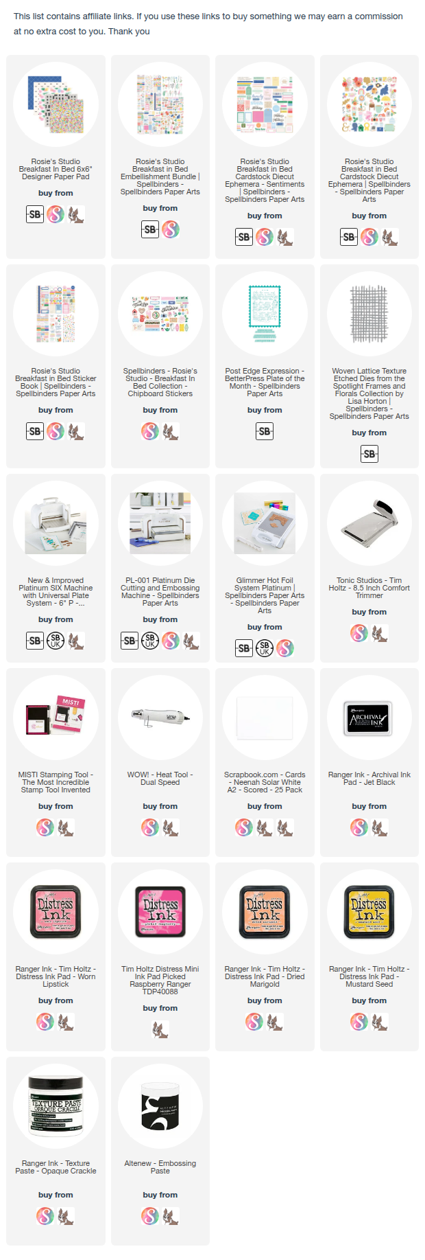
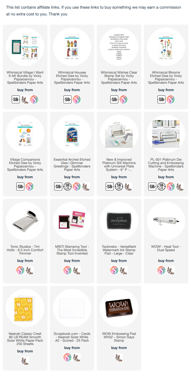
I have listed listed all the supplies below for you. (Some links may be affiliate links at no extra cost to you—thank you for supporting my work!)

I started by building soft, textured backgrounds using light ink blending, subtle stenciling, and a few splatters to add that mixed media feel without overwhelming the designs.

Then I layered ephemera pieces from the Breakfast in Bed collection to create small focal scenes on each card.

Floral & Sentiment Card:


A soft pastel background paired with layered florals and sweet sentiments to create a light, uplifting design. I love the foiled details, paste details and the text from the Post Edge Expression- Better press Plate April 2025


Home Scene Card:


I combined the house, rainbow, and floral elements to create a cozy, storytelling composition—perfect for celebrating everyday memories. I added some white and gold splatters here. Gold splatters enhances the foil details in the floral centers.


Friendship Card:


This one has a slightly more artistic feel with stamped florals, texture paste details, and pops of color layered with ephemera. Since I don't own any stencil from Spellbinders, I created my own, using the Woven Lattice Texture Die. This is fun and as they say, where there is a will, there is a way...lol. Here too I used the Post Edge Expression- Better press Plate April 2025 for more texture.


Celebration Card:


A cheerful mix of florals in jars with bright accents and a bold sentiment—perfect for birthdays or special moments. I created my own, using the Woven Lattice Texture Die. 


To finish, I added small details like butterflies, splatters, and dimensional layering to bring each card to life.

Design Tips
Start with a soft background—let the ephemera be the star
Use foam adhesive to create subtle dimension between layers
Combine different textures (ink, paste, splatter) for interest
Keep a consistent color palette across multiple cards for a cohesive set

Thank you so much for stopping by today! I hope this inspires you to pull out your ephemera and create your own mixed media card set—sometimes the simplest elements can come together to tell the most beautiful stories.

Saturday, March 21, 2026

Spellbinders - Cherish These Days – A Cozy Traveler’s Journal Spread

Hi crafty friends,
I’m so happy today sharing a cozy and playful traveler’s journal spread featuring beautiful products from Spellbinders Rosie's Breakfast in Bed collection. This spread is all about slow mornings, warm drinks, and capturing those little everyday moments we often overlook.


As soon as I saw the images of this collection, I was reminded of a Mother's Day a few years back. I literally got my breakfast in bed with blueberry pancakes, tea, croissants, buns and so on....talk about coincidence...lol

For this spread, I wanted to document a simple, feel-good morning memory. I kept the color palette soft and fresh with blues, pinks, and warm neutrals to create a light and cheerful mood across both pages. These colors are all part of the collection, so I didn't need to put in any extra effort :)


I started by building a layered background using patterned papers to anchor each page while keeping the overall look cohesive.

Left Page:
I created a breakfast-themed cluster with pancakes, coffee, and a cute alarm clock. The small sentiments and tags help tell a story—almost like little notes from the morning.


Right Page:
This side focuses on a cozy coffee moment with layered die-cuts, including toast and a croissant for added warmth and charm. The main sentiment “Cherish these days” becomes the focal point and ties the entire spread together.


To finish, I added light paint splatters for subtle texture and movement—just enough to keep things organic without overwhelming the design.

Here are some tips:
Use repeating colors across both pages for a cohesive spread
Mix structured patterns (like grids) with soft elements for balance
Layer die-cuts in odd numbers for a more natural composition
Add small sentiments to create a storytelling effect

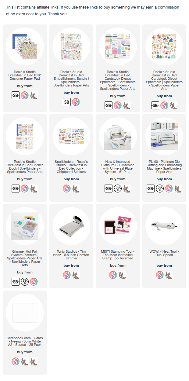
You can find the full list of supplies in the description below.
(Some links may be affiliate links at no extra cost to you—thank you for supporting my work!)
Do let me know if you want me to share more of this style too.   

Tuesday, March 3, 2026

Spellbinders - Masculine Birthday Shaker Card | Ink Blending Tutorial

There’s something about shaker cards that instantly makes a design feel more celebratory — and this bold birthday card was such a fun one to create.


For this project, I used the Spellbinders Aged to Perfection collection and leaned into rich blue and mustard tones for a slightly masculine birthday look. The combination feels vibrant, modern, and perfect for those April celebrations.

This design actually evolved as I was making it, I love how the final octagon shaker frame keeps everything structured and clean.

Watch the Full Video Tutorial


If you’d like to see:
How I blended the background for a smooth gradient
How I sealed the shaker frame (no escaping sequins!)
How I layered the “YAY” die cuts for extra dimension
And how this design changed midway

You can watch the full step-by-step tutorial above.

I am on Spellbinders blog today with a trio of cards. Here is the peek. Check out the details on their blog.

I started by blending Waterfall ink in the center of the panel, building color gradually in soft layers.
At the top, I added Marigold ink, 
I then, switched to Seaside ink to better balance the palette — and I’m so glad I did. It ties everything together beautifully.


Using the octagon dies, I created the shaker frame and adhered acetate to the back using strong double-sided tape. 

Inside the shaker, I mixed flat sequins in different blue tones along with iridescent beads and silver accents. Mixing sizes and finishes adds more visual interest when the card moves.


The layered “YAY” die cut is definitely the star of this card.

I die cut it in white, gray, and silver glitter cardstock. The white layer acts as the shadow, layered slightly offset over gray for depth. Then I added a thin silver glitter sliver along the edge for an extra dimensional highlight.

I also ink blended the letters using the same background colors, keeping the darkest tones at the base for natural shadow and cohesion.

For the sentiment, I used the bold numbers press plate and foiled it in black before cutting it with the coordinating banner die.

I layered the sentiment over cardstock strips inked in Marigold and Seaside, slightly offset for added dimension and color balance.

To enhance the celebratory feel, I die cut small silver shapes using the Gifting Bow dies and added them as custom confetti accents on the card front.

The bold blue + mustard combination feels fresh, energetic, and perfect for a masculine birthday theme.

Are you a fan of shaker cards? Would you keep this bold blue and mustard palette, or switch to brights or pastels for a birthday design?

I’d love to know how you’d reinterpret this card! Thank you for stopping by and have a nice day!

Saturday, February 21, 2026

Foiling AND Watercoloring using the BLOCK PRINT ZODIACS COLLECTION by Spellbinders

Hello crafty friends, I am so excited to be on Spellbinders blog today with a trio of cards using the BLOCK PRINT ZODIACS Collection.  I was inspired to create with zodiacs because they celebrate personality and individuality, making each design feel personal and intentional

I love experimenting with different techniques, and zodiacs feel mysterious and ever-changing to me. That’s why I chose watercolors—no two results are ever the same. I added foil details on watercolor cardstock using my Glimmer machine to enhance that sense of magic and depth. I used the watercolors by Pinkfresh Studio.

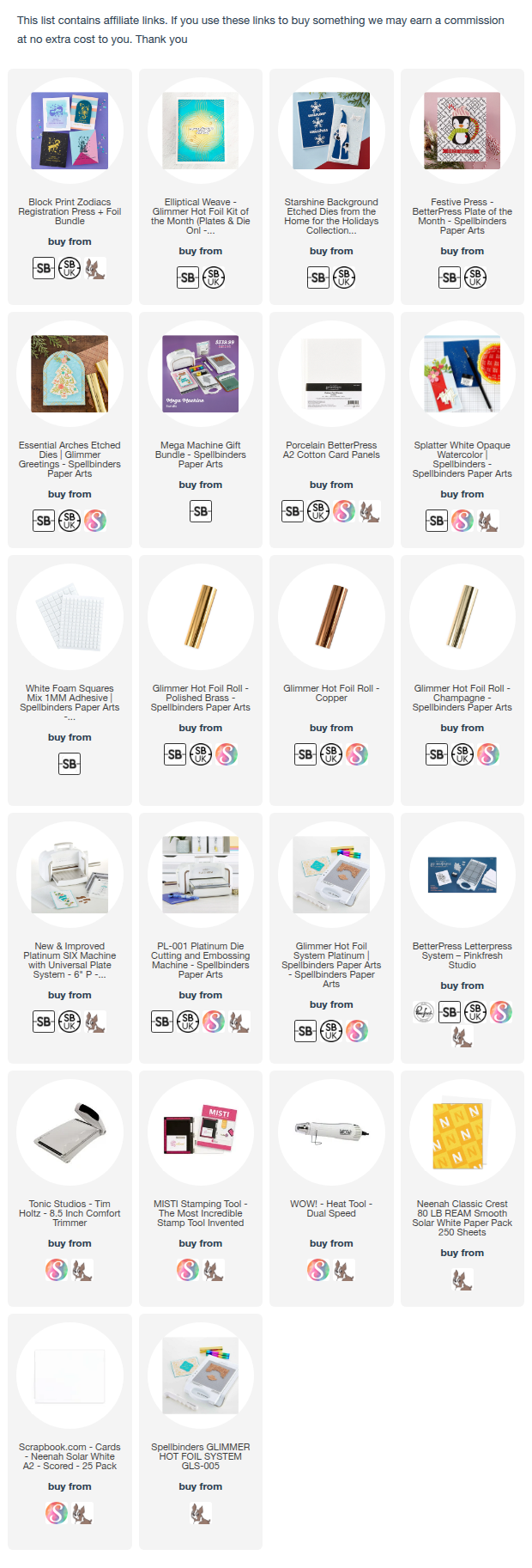
I have the full supplies in the description below. I appreciate if you purchace with my affiliate links at no extra cost to you.

Here is a card I created for my followers and then I will share a sneak peek of my cards on the Spellbinders blog where I have a full tutorial.

Libra Zodiac Card – Soft Celestial Ink Blending

For this card, I wanted to capture the gentle balance and airy elegance that Libra represents. Instead of going bold and dramatic, I chose a dreamy pastel palette with soft transitions and subtle texture to echo harmony and calm.


To elevate the card without adding a lot, I layered the blended panel over a subtly textured white background panel

A soft aqua card base that ties back to the main color palette. This framing keeps the composition clean while adding depth.

The contrast between soft watercolor and bold Espresso Foiling creates instant impact.  
Limiting the palette keeps the card cohesive. The arched shape adds elegance and movement.

Sneak Peek with step by step on Spellbinders  blog :


Although all three cards follow the same basic process, each zodiac sign was approached with its own color story to reflect personality, symbolism, and mood. This keeps the designs cohesive while allowing each card to feel intentional and unique.


Thank you so much for stopping by today! You can find more inspiration on my blog, Instagram and YouTube channel.


Thursday, October 30, 2025

Cozy Winter Greetings with Spellbinders and Simon Hurley

 Hello everyone!! Welcome to my cozy corner of winter crafting! Today, I’m sharing a trio of cards created with the new ski-sons-greetings collection by Simon Hurley at Spellbinders — featuring charming A-frame cabins, snowy trees, and a cheerful skier gliding through frosty hills.

For my friends in Switzerland, it's also available at the shop Scraphouse.


I fell in love with the small cabin and the embossing folders and the skiers are so close to my heart :) These dies make it so easy to create little winter stories — whether it’s a season of cheer, a happy new year, or winter greetings, there’s a touch of magic in every layer! 
Grab your inks, a hot drink, and let’s dive into some winter inspiration

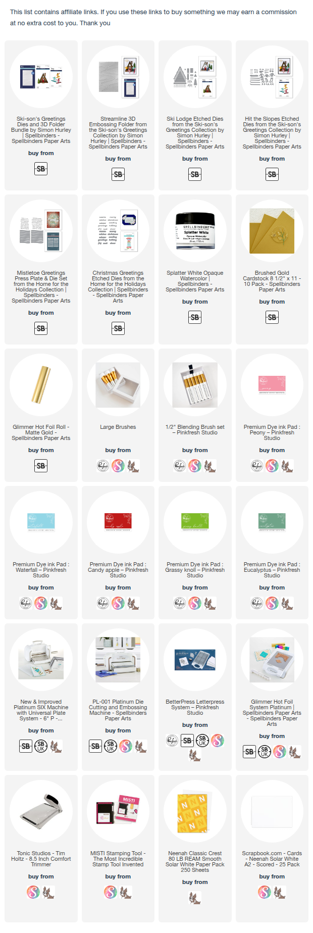
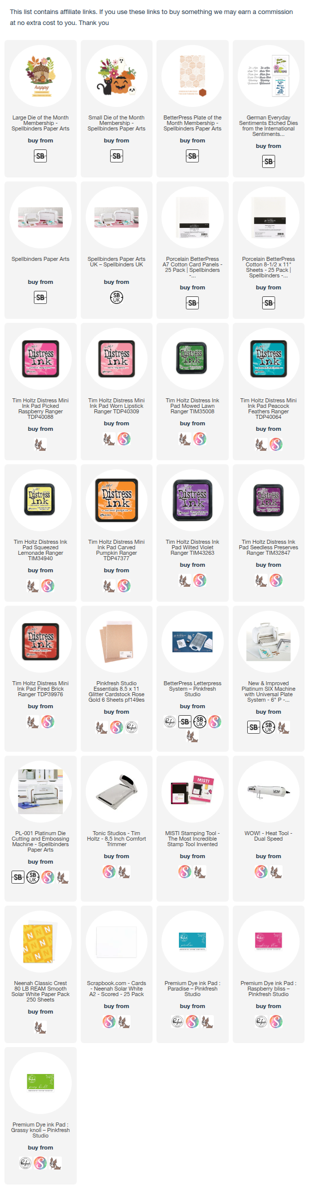
I have linked the supplies below for easy access to you :) I did make a video, which I will be adding within a week I hope.

Card 1 – Season of Cheer 


For this card, I chose a deep red cabin against a soft blush pink sky. I used the Ski Lodge, Streamline embossing folder along with the Mistletoe Greetings from the previous release, which I used my glimmer to hot foil. The background has that gentle snowy swirl, created using the embossing folder for subtle texture. 


I ink-blended around the trees and roofline for contrast, then finished it off with a simple sentiment banner: “Season of Cheer”


It feels like a warm cabin glowing in the middle of a quiet snowfall :)

🎿 Card 2 – Winter Greetings


This one captures the fun and sporty side of winter! I used the Ski Lodge, Hit the Slopes, Streamline embossing folder along with the Christmas Greetings Etched Dies.


I added the adorable skier die cut, surrounded by evergreens dusted with ink-blended greens. The sentiment “Winter Greetings” is stacked in soft pastels with a touch of shimmer to bring in that frosty, magical light. I used a soft ombré blend of blue, lilac, and pink for the sky to give it that crisp winter morning vibe.

🎄 Card 3 – Happy New Year


For the final card, I went bold and bright! I used the Ski Lodge, Streamline embossing folder along with the Mistletoe Greetings from the previous release, which I used my glimmer to hot foil.


A pink A-frame cabin sits against a rich red background, dotted with white splatters to mimic falling snow. I love how the mix of warm pinks and cool greens gives a festive, slightly retro holiday feel. The banner saying “Happy New Year” ties it all together — cheerful and full of hope for new beginnings.

I had so much fun playing with this collection — it’s the perfect mix of cozy and creative!
Which one would you like to create this winter: the red cabin, the pink-frame, or out on the ski slopes? ⛷️
Thank you for stopping by and have a nice day!

Thursday, September 11, 2025

Spellbinders - From Bold to Delicate: September Club Kits Inspiration

Hello friends!
I’m excited to share two cards I created using the Spellbinders September Club Kits

This month’s sets are so beautiful and versatile—it’s perfect for both bold, colorful projects and softer, clean-and-simple designs.

✨ Card 1 using DOML and the BPOM


For my first card, I went with a bold look! I blended rich reds and pinks for the background, added a touch of texture, and then framed the card with sparkly gold. The layered die-cut leaves bring in all the autumn vibes with bright pops of color. I love how cheerful and festive this one feels!

Steps:
  1. Letterpress a white panel with the Better press of the month plate.
  2. Start by ink blending a piece of white cardstock with shades of pink and red inks. Layer the colors until you achieve a rich background.
  3. Die-cut the rectangular frame from Rose gold glitter cardstock. Adhere it over the blended panel using 3D foam.
  4. Die-cut multiple leaves from white cardstock for the Large Die of the month . Ink blend each in fall colors like yellow, green, orange, and pink and turquoise.
  5. Arrange and adhere the leaves to the corners of the frame for a clustered effect.
  6. Die-cut the “Hallo” sentiment from the German Everyday Sentiments Etched Dies from the International Sentiments Collection
  7. Add color to create an ombre look. Back it with a vellum shadow for softness, then adhere it to the center.
  8. Mount the panel to a card base and finish with splatters or gems if desired.

✨ Card 2 using DOM and BPOM


For the second card, I took a softer approach. I added loose watercolor splatters in shades of pink and then layered the delicate die-cut foliage in pastel hues. The result is airy, fresh, and full of dimension while keeping the design clean and modern.

Steps:
  1. Letterpress a white panel with the Better press of the month plate. Sponge pink ink.
  2. Take a piece of watercolor cardstock to size. Create pink watercolor splatters across the background. Let dry.
  3. Die-cut a stitched rectangle panel and adhere it over a dry embossed card base for subtle texture.
  4. Die-cut foliage from white cardstock. Lightly watercolor in pastels—greens, pinks, and Turquoise.
  5. Cluster the foliage in the center. Adhere some flat and others popped up with foam tape.
  6. Die-cut the “Hallo” sentiment from white cardstock and layer it with a black shadow for contrast.
  7. Place the sentiment over the foliage to complete the design.
Hope you enjoyed todays cards. Thank you for dropping by and have a nice day!

Friday, August 8, 2025

Spellbinders: Handmade Winter Cards Using July Clubs

Hello crafty friends!! Today I’m sharing four cheerful winter card ideas that are easy to recreate using Spellbinders July Club Kits. 
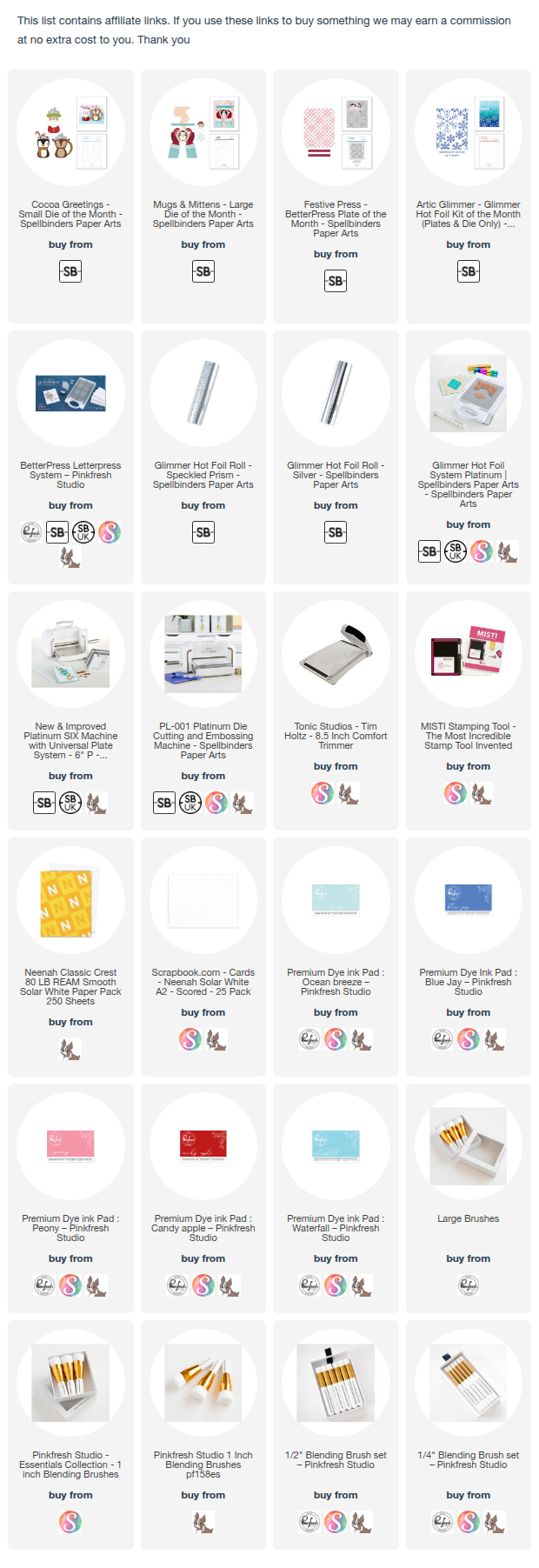
Each card features die cuts, ink blending, and clean sentiments that make them perfect for seasonal greetings. Let’s look at how to make them!

Card 1 – Gingerbread Winter Hugs  using July BPOM and CLD club kits


How to Make It:

Die-cut the gingerbread shape.
Ink blend using Peony dye ink to create soft shading.
Use small dies to add details 
Emboss a piece of white cardstock using the Betterpress plate to create a textured background.
Assemble: Cut triangle shapes from the embossed panel. Adhere the embossed panels to your card base. Add the gingerbread man on foam tape.
Attach the sentiment strip across the bottom.
Tip: Ink blending around the edges adds dimension without needing extra layers.

Card 2 – Cozy Mitten Hugs using Large Die of the Month and GOM


How to Make It:
Die-cut the mitten pieces.
Lightly ink blend the mittens and cuffs for shading.
Create the background by foiling the glimmer plate using Speckled Prism Foil 
Blend soft pink ink over the background to highlight the pattern.
Adhere the background panel to the card base. Die-cut a circle and adhere the embossed panel from the betterpress plate. Add the mittens with foam tape.
Finish with your sentiment strip.

Tip: Use metallic foil to make the snowflakes stand out.

 Card 3 – Snowman Let It Snow using Glimmer of the Month


How to Make It:
Die-cut the snowman pieces and assemble them.
Create the background using a snowflake glimmer plate using silver Foil. Here I used the reverse foiling technique here. 
Lightly blend blue inks over the snowflakes to add color.
Attach the background panel to your card base.
Mount the snowman on a small circle die-cut from vellum.
Add your sentiment strip underneath.
Tip: Ink blending over foil creates a unique iridescent effect.

Card 4 - Penguin Season’s Greetings Card using Die of the Month

This card is sure to bring a smile with its cute penguin mug and festive colors. It’s perfect for sending warm wishes all winter long.


Die-cut the penguin mug parts from black, white, and orange cardstock. I also used glitter CS.
Assemble the penguin by gluing the pieces together. Add the scarf and tiny heart.
Die-cut candy canes and whipped cream and attach them to the top of the mug.
Emboss a white panel with a subtle pattern to create background texture.
Mask and lightly blend aqua ink in the center of the panel to create a soft diamond of color.
Layer everything on a red card base.
Glue the embossed panel.
Adhere the penguin with foam tape for dimension.
Add the sentiment at the bottom.

Tip
Try switching the scarf color to match your favorite holiday palette!

These cards show that you can combine basic die cuts, ink blending, and clean sentiments to create winter cards with lots of personality. No complicated techniques—just simple steps and a bit of color.

Which one is your favorite? Let me know, and happy crafting!