"Honey, Limes & a Whole Lot of Gold"
Hello crafty friends! I'm so excited to be joining the Pinkfresh Studio “The Simple Things” Release Blog Hop today.
I've got three cards to share today: one that's pure cozy comfort, and two that are all about gorgeous, heirloom-style flourishes. Plus, stick around to the end, because I'm sharing the one little trick that made the biggest difference on these cards.
Supplies
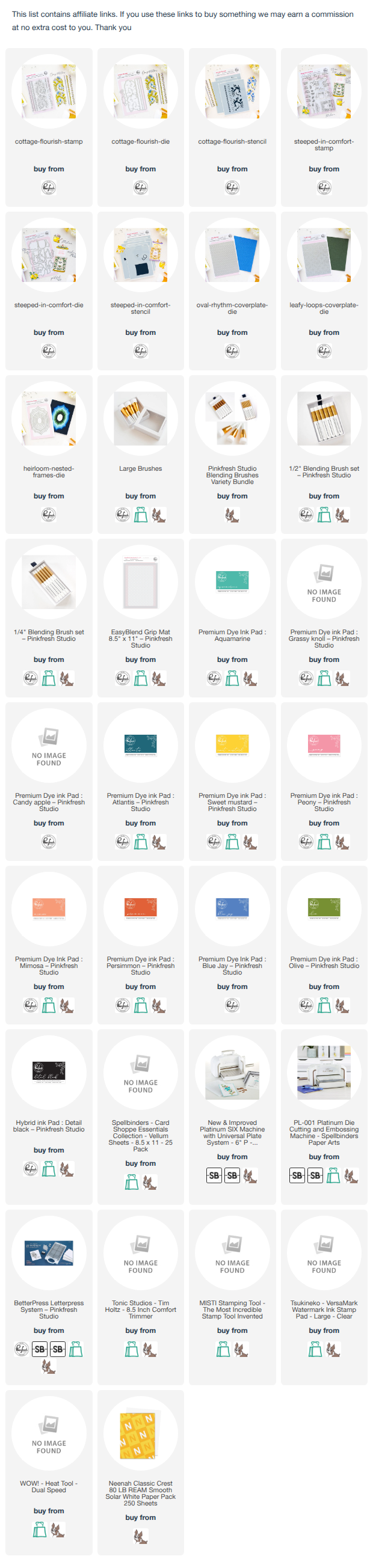
I've linked all of the products used below. If you enjoy experimenting with color, you'll definitely want to take a closer look at these products. I have used affiliate links at no extra cost to you but it helps me keep everything running :)
For the next two cards I used the Cottage Flourish stamp, stencil and dies along with the Leafy Loops cover plate

Card 1: Old-World Elegance
Now for something completely different. The Cottage Flourish set has this beautiful, vintage textile feel, like something you'd find embroidered on a treasured family tablecloth.


I heat embossed the flourish and borders in gold on vellum and white card. Sponged aqua ink to a white panel, then added color to the leaves and blooms using stencils. The Leafy Loops texture up top adds a delicate dotted pattern that catches the light without stealing the show.

For the sentiment I used "Wishing you all the best", simple and classic.
Card 2: Same Stamp, Totally New Personality
This is where things get exciting. Using the same flourish, I went bold: rich teal, coral and sunny yellow, all outlined in gold.


I cut it out and layered it over a blush embossed background, then grounded it with a strip of candy apple red. A shadowed "Congratulations" ties the colors together.

Card 3: A Hug You Can Mail
Let's start with the sweetest set in the release, Steeped in Comfort. A honey jar with a ruffled lid, juicy limes, and a honey dipper mid-drip? Yes please.
I used the Steeped in Comfort stamp, stencil and dies along with the Heirloom Nested Frames die and Oval Rhythm cover plate

I colored the jar in deep, glowing oranges so it looks like sunlight is shining right through the honey, then gave the limes a fresh, zesty green. Here's the fun twist: instead of green leaves, I went with blue. It's unexpected, it cools down all that warmth, and it makes the whole scene pop.

The background is where the magic happens. I dry embossed a panel with Oval Rhythm, then ink blended from a soft buttery yellow in the center to warm orange at the edges.

That glow draws your eye right to the middle, where a vellum frame from Heirloom Nested Frames softens everything like a little window. "Sending a warm hug" was the only sentiment that made sense. And yes, that tiny gem on the jar's bow is my favorite detail...lol
So what's the secret? Contrast. Blue leaves in a warm orange scene. Gold lines against soft aqua. A punch of red under a pale blush panel. Every time a card felt "almost there," adding one contrasting element finished it. Try it on your next card and see what happens!
Which one's your favorite, cozy honey jar or gold flourish? Tell me in the comments! 💛
Pinkfresh Studio will be giving away the full release on the Pinkfresh blog & YouTube channel.
As well as a total of Five $50 gift cards along the hop. As usual the winners will be selected from the comments.
Pinkfresh Studio will pull the winners & post them on October 2, 2026, on their GIVEAWAY PAGE.
Don't forget to check that page & claim your prize within 2 weeks.
There’s a full blog hop with inspiration and giveaways, so be sure to check out all the stops.

Here is the link to complete HOP list
Happy crafting,
Isha