Thursday, February 26, 2026

Pinkfresh - Watercolor Spring Florals | Easy Layering Technique for Beautiful Depth

Hello everyone! I am on Pinkfresh Studio YouTube channel today, with a fun inspiration.

There’s something about spring florals that instantly lifts the mood. The soft pinks, fresh yellows, peaches, and touches of lavender feel like a gentle reset after winter. For today’s card, I wanted to capture that feeling using liquid watercolors and simple layering techniques to create natural depth and dimension.

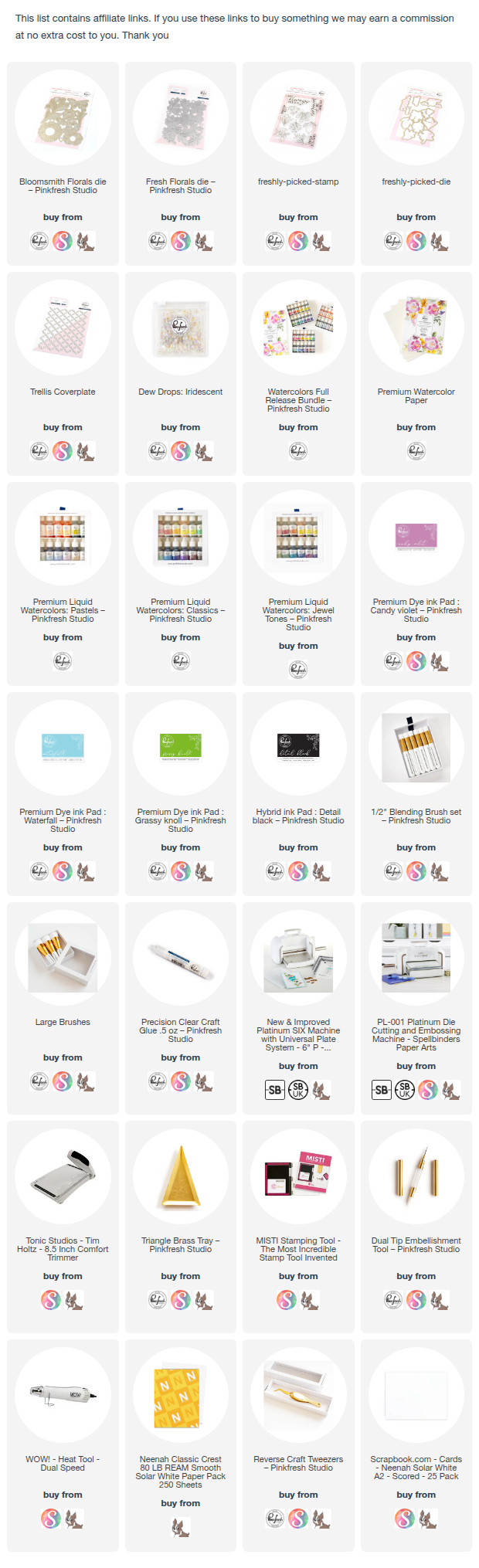
All the supplies are in the description below. I have affiliate link, and I appreciate, you buying using the links at no extra cost to you. This helps Pinkfresh know my love for their products and it helps me create more content for you all.


One of my favorite things about liquid watercolors is that they can be reactivated with water once dry. That makes the process very forgiving — and perfect for slow layering.

I always begin with a light wash. Starting softly allows the pigment to move naturally across the paper. Water does most of the blending work — guiding the color instead of forcing it. Once the base layer is dry (or slightly damp), I gradually deepen the tones by adding more concentrated pigment near the base of the petals or in overlapping areas.


Layering slowly creates smooth transitions and realistic shadows. It’s always easier to add more color than to remove it.

For this card, I worked with Ballet Slippers, Marigold, Beach, Mulberry Blush, Raspberry Bliss, and Candy Violet — a palette that feels unmistakably spring-like.
To complement the softness of the florals, I embossed a Trellis cover plate background. Embossing adds texture without competing with the focal point, keeping the card elegant yet interesting.


White acrylic splatters added an organic finish, while black splatters near the sentiment visually tied everything together. A few iridescent dew drops completed the look with subtle sparkle and dimension.

This card is a reminder that beautiful results often come from patience — soft washes, gradual layering, and thoughtful details. Spring colors naturally invite softness and lightness, and I love how they bring a sense of renewal to handmade projects.


If you’re creating seasonal florals, try layering slowly, adding subtle ink shading, and incorporating texture through embossing. Small details truly transform the final piece.

Which spring color are you most drawn to right now — soft pastels or brighter tones?

Saturday, February 21, 2026

Foiling AND Watercoloring using the BLOCK PRINT ZODIACS COLLECTION by Spellbinders

Hello crafty friends, I am so excited to be on Spellbinders blog today with a trio of cards using the BLOCK PRINT ZODIACS Collection.  I was inspired to create with zodiacs because they celebrate personality and individuality, making each design feel personal and intentional

I love experimenting with different techniques, and zodiacs feel mysterious and ever-changing to me. That’s why I chose watercolors—no two results are ever the same. I added foil details on watercolor cardstock using my Glimmer machine to enhance that sense of magic and depth. I used the watercolors by Pinkfresh Studio.

I have the full supplies in the description below. I appreciate if you purchace with my affiliate links at no extra cost to you.

Here is a card I created for my followers and then I will share a sneak peek of my cards on the Spellbinders blog where I have a full tutorial.

Libra Zodiac Card – Soft Celestial Ink Blending

For this card, I wanted to capture the gentle balance and airy elegance that Libra represents. Instead of going bold and dramatic, I chose a dreamy pastel palette with soft transitions and subtle texture to echo harmony and calm.


To elevate the card without adding a lot, I layered the blended panel over a subtly textured white background panel

A soft aqua card base that ties back to the main color palette. This framing keeps the composition clean while adding depth.

The contrast between soft watercolor and bold Espresso Foiling creates instant impact.  
Limiting the palette keeps the card cohesive. The arched shape adds elegance and movement.

Sneak Peek with step by step on Spellbinders  blog :


Although all three cards follow the same basic process, each zodiac sign was approached with its own color story to reflect personality, symbolism, and mood. This keeps the designs cohesive while allowing each card to feel intentional and unique.


Thank you so much for stopping by today! You can find more inspiration on my blog, Instagram and YouTube channel.


Thursday, February 5, 2026

Pinkfresh Studio “Homespun with Heart” Release Blog Hop

Hello crafty friends! I’m excited to share a closer look at a few cards I created using products from the Pinkfresh Studio "Homespun with Heart" Release. This collection is perfect if you enjoy layering, delicate details, and projects inspired by handmade creativity and a touch of romantic vintage asthetic.

All the supplies are listed below. Many of you want me to share more videos, with the cardmaking process and I am sharing one below Or subscribe to my channel: @ishaguptadesigns


First two cards focus on sewing and crafting themes, combined with soft colors and dimensional die-cut elements.


Card 1 – Handmade Sewing Tools Card 
I used sewing themed dies to build a layered arrangement featuring thread, scissors, glasses, and small sewing accessories.


  • I started with a soft pink ink blended background to create a warm base.
  • The panel was embossed to add subtle texture without overpowering the focal elements using the Petal Trellis coverplate.
  • I used the Heritage Lace die to create decorative borders at the top and bottom. These details help frame the card while keeping the design light and elegant.

  • For the sewing elements, I inked through the stencils of the Maker's Essentials, die-cut using the coordinating Maker's dies and layered using foam adhesive to create dimension.
  • I finished the card with a simple “Made with Love” sentiment from the Heartmade Greetings stamp and a few Iridescent Dew drops.

Card 2 – Thread Spool Handmade Card

For the second card, I focused on Thread Spool as the main design element. I wanted this card to feel soft, playful, and slightly modern.


  • I added small tags, pins, and floral details to enhance the handmade sewing theme.
  • The same “Made with Love” sentiment ties both cards together and reinforces the handmade message.
  • Added a few Iridescent Dew drops for subtle shine, movement and balance.

This design shows how repeating shapes like spools can create visual rhythm while still feeling clean and structured.

VIDEO


Card 3 – Timeless Handmade Elegance Card

This last card leans into a romantic vintage-inspired aesthetic with subtle Victorian influence, while still keeping a clean and contemporary cardmaking approach. I used Freshly Picked (stamp, stencil and dies), Cottage Frames (stamp, stencil and dies), Room for Joy stamp and dies, Stitched Basket Weave Coverplate


The decorative layered frames and floral vignettes draw inspiration from traditional Victorian stationery and ornamental paper crafts, where framed botanical elements were often used to create elegant focal points. The soft pink blended backgrounds inside the frames help recreate that classic cameo-style look that is commonly associated with vintage paper design.


To keep the card feeling fresh and modern, I paired those ornate elements with a structured layout, bold contrast layering, and plenty of open space. The stitched background texture adds quiet detail without overwhelming the florals, allowing each framed element to stand out individually while still working together as a cohesive composition.


I love combining vintage-inspired details with modern cardmaking techniques because it creates projects that feel timeless but still current. Giveaway
Pinkfresh Studio will be giving away the full release on the Pinkfresh blog & YouTube channel.
As well as a total of TEN $50 gift cards along the hop. As usual the winners will be selected from the comments.
Pinkfresh Studio will pull the winners & post them on February 12, 2026, on their GIVEAWAY PAGE.
Don't forget to check that page & claim your prize within 2 weeks.

Here is the link to complete HOP list
CLICK TO ENTER HERE

Thank you so much for dropping by and have a wonderful weekend!