
Hello crafty friends!! I am so excited to join Pinkfresh Studio "Delicate Release" bloghop. This release is versatile as always and I love it.

NEWS: Do take advantage of the Cyber Monday sale HERE and you don't wanna miss this for sure :)

Today I decided to focus on the Bloom & Brew product suite - a beautiful mix of teapots, teacups, and detailed florals that come together easily. What I really love about this set is that, there is a stencil in the set, which covers all the images, and we can add color to the background.
I am sharing two cards, I kept both cards centered around ink blending for smooth gradients and bold contrasts, then finished each panel with different color stories to show how versatile the set can be.

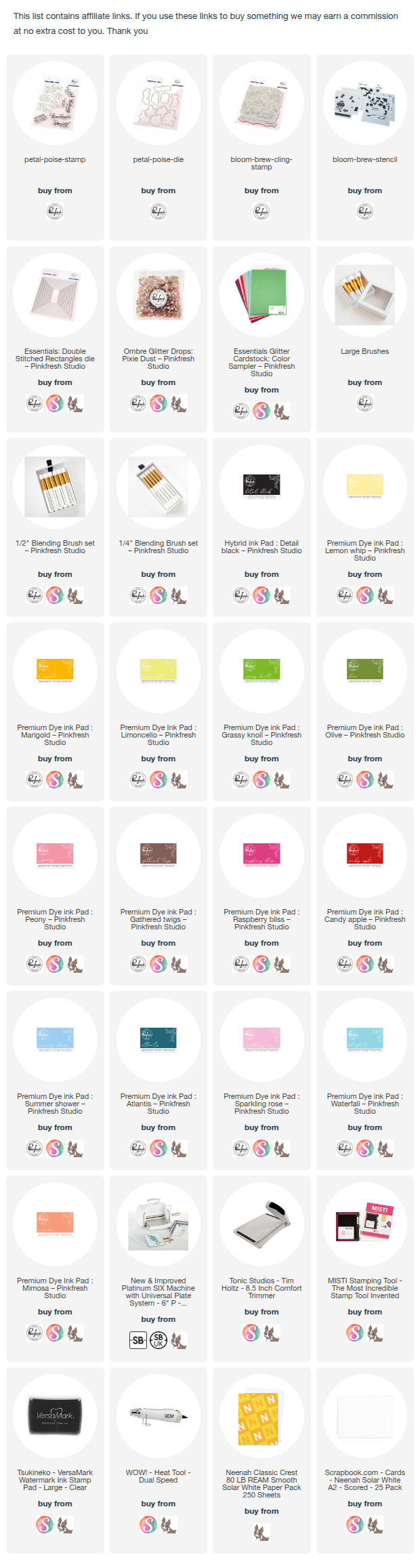
All the products are linked below.
CARD 1 — Soft Garden Teapot Shaker (Bright + Airy Version)

I started by, adding color to the teapot, cup, and florals using the coordinating shades of teal, pink, and yellow.
I kept the images brighter in the center and slightly darker toward the edges for depth.

For the background, I started by ink blending a soft green backdrop using Mint and Meadow inks. Then added depth using Emerald City and Evergreen inks. Sentiment: For a special someone — offset was turquoise glitter card.

I layered and added a stitched frame to give the layout an elegance, and create the shaker element. Finally, I added the sentiment on top of the acetate window.
CARD 2 — Moody + Deep Version

The teapot and cup were colored in bright yellows and soft corals to pop against the dark backdrop.
Florals were kept bold and saturated, leaning toward reds and blues.

For a dramatic contrast background, I blended deeper tones of all the colors. I used Turquoise, Lush Forest, Evergreen and Black inks.

This shifts the mood completely — almost like an evening high-tea scene.
A dark green frame helps anchor the entire design. I used some Ombre glitter drops: Pixie Dust
Final Thoughts
Using one design set in completely different color palettes is a great way to stretch your supplies. The Bloom & Brew set lends itself naturally to both soft, cheerful tones and bold, dramatic scenes. Ink blending remains an easy and controlled way to build backgrounds that look polished without extra layers.
If you try either palette, I’d love to know which direction you choose — bright or moody!
Thank you so much for dropping by and have a wonderful weekend!
42 comments:
I LOVE your colorful teapots! Both cards are amazing!!!
This is so exotic and pretty. It makes me want to have a tea party for friends.
I love, love, LOVE the Bloom and Brew suite and to see two inspiring samples using this new suite - wow! Your cards are truly beautiful
I love both of your cards. Great way to show different ways to make it. Thanks for you inspiration.
love this special cards with those special colors!!!
Both cards are beautiful, but I cannot take my eyes away from the intense and stunning contrast of the green & yellow! WOWZERS!!
Thump goes my heart! LOVE both of your cards--fab designs and colors! This Bloom and Brew Collection is my most favorite!!!
I am a fan of tea sets. Such a beautiful moody cards. Love them all
The yellow teapot is stunning and the rich green background really makes the teapot the focus of the card.
I love the card with the darker green background. Very pretty.
Gorgeous cards!
It was really interesting to see how different these two scenes look just from using different colors. Both of them turned out lovely! The darker colorway is especially dramatic and eye-catching.
These would be perfect cards to give to one of my best friends who collects tea pots. Always fun to have tea with her as she brings out a different teapot. Love the shaker card and the frames you used in both the cards. Beautiful color blending as always!
Beautiful work
Very beautiful! love the Bloom & Brew!
Love how your color choices created two cards with totally different vibes! The bold colors in the second card are my favorite.
Marisela Delgado said: Absolutely gorgeous 💜 mariandmonsterd@yahoo.com
Marisela Delgado said: Gorgeous colors, too. 💜 mariandmonsterd@yahoo.com
Beautiful cards! Love that set!
Both cards are gorgeous, your rich colour palettes are very you. I like the first slightly more
Absolutely fantastic cards. I love the way you’ve shown how colours can change the entire appearance of the cards side by side.
Gorgeous, Gorgeous cards.
Gorgeous cards, Love the dark background, really makes your image pop!
I didn’t even realize the first card was a shaker. I was so captivated by that green and how perfectly blended it looked. That green was definitely an airy feel and then admiring the rest of the card to realize it’s a shaker just took it over the top. Your second card again, was absolutely gorgeous and left me with a rich smoothe feel.
Love the difference in the lighter greens vs the card with the darker greens. Both are stunning
That dark green is GORGEOUS.
That teapot in yellow is striking, lovely cards
Both fabulous cards!
Isha, Your cards are gorgeous. I admire your ability to choose such beautiful color combinations.
The first card is my favorite of the two. Such light and bright colors, yum!
Oh Isha, these cards are gorgeous! Love your rich coloring!
I love the different color combinations! Your cards are beautiful!
Such beautiful cards!!
I really love your cards and the color choices. Thanks for sharing
Your cards are so beautiful! I love the colors you picked and the designs are so pretty. Thank you for Sharing your Creations!
Very beautiful and inspirational card designs!
Green is my favorite color, so love both cards!
Gorgeous cards! Love the teapot ❤️
Love this beautiful design and your fabulous color combos! Gorgeous cards!
Two fabulous cards Isha, you have such a great eye for colour combos! I particularly love the darker one - so dramatic!
These two look like Spring and Winter! And I'm loving it so much how you changed the feel with just the color palette. Beautiful cards and I adore the greens!
These cards are lovely! (And glad I can finally comment on one of the blog hop posts. I keep getting the message that the link is broken. Weird.)
Post a Comment