
For my cards, I challenged myself to use the same beautiful product suite while exploring three completely different techniques and styles. I always love stretching my supplies and showing how versatile one stamp and die set can be — especially when small changes in color, texture, and background techniques can create a totally new feel.
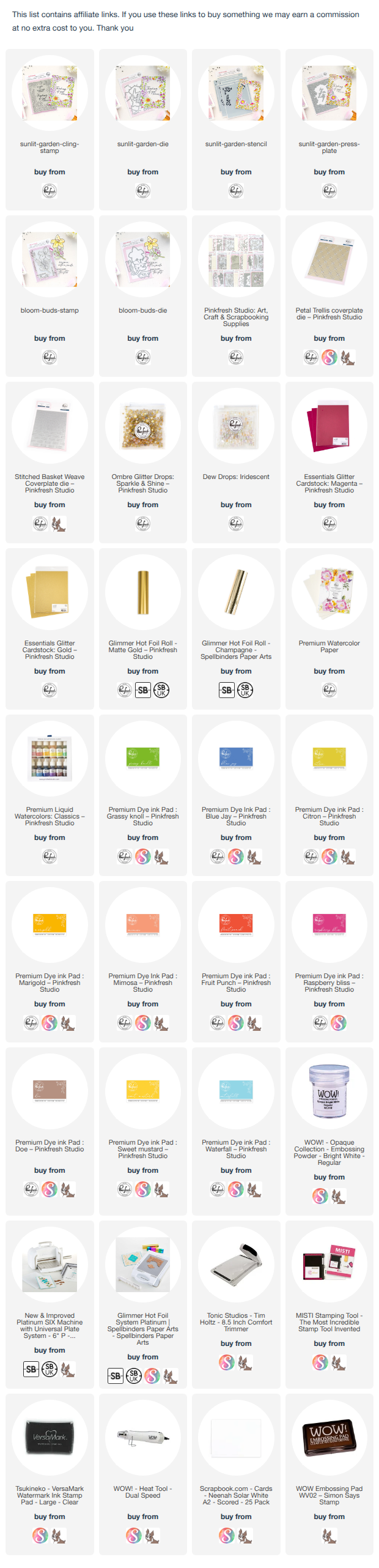
For all three cards, I used the gorgeous Sunlit Garden product suite (Stamp, press plate, dies and stencils). I used the sentiments from the Bloom and Buds stamp and dies. From soft watercoloring to bright layered ink blending and clean dimensional details, these cards each tell their own little story while still feeling cohesive together.

For the first card, I wanted a soft, dreamy look with a delicate watercolor feel. I started by creating a loose yellow- peach watercolor background with soft splatters and subtle texture.


I really love how calm and delicate this card feels — almost like sunlight softly shining through a garden.
For the second card, I switched gears completely and went bold and colorful!

This time, I used the press plate and used champagne foil for foiling. I also used the reverse foiled image to create a shadow behind the floral image. I used bright ink blending on all the florals to create a cheerful rainbow-inspired garden frame. The vivid pinks, oranges, yellows, greens, and blues instantly make this card feel playful and full of energy.

For the center background, I added soft watercolor wash using the Classic watercolors along with subtle texture embossing to create interest without overpowering the florals. I used the Basket Weave plate for it. I love how the cool blue center balances all the warm floral tones around the edges.
The layered the sentiment in the center, while a few clear iridescent drops added extra detail and shine.

This card really shows how changing only the coloring style can completely transform the same design.
Let me know if you want to see a process video for this card :)
For the final card, I wanted something that felt crisp, clean, and detailed while still keeping all the beautiful floral elements.

I used the press plate again and used matt gold foil for hot foiling. I colored the florals with more contrast and deeper shading this time, combining warm pinks, yellows, blues, and corals for a richer look. Instead of adding a watercolor background, I ink blended pink, turquoise and yellow lightly and added texture with subtle embossed detail using the Petal Trellis cover die, so the florals became the main focus.


This ended up being one of my favorite styles because it feels detailed and vibrant without becoming too busy.
That’s one of my favorite things about crafting — taking the same supplies and turning them into completely different styles simply by changing techniques, colors, and textures.
Thanks so much for stopping by today! Happy crafting and have a wonderful day!
52 comments:
These are both SO pretty - absolutely love the colors!
Raspberry Bliss and Mango Sorbet are SUCH good colors together, but I never thought to add Waterfall! What an inspired idea, thank you!!
Beautiful cards. Love your use of vellum in your one card
Gorgeous cards Isha, love all the colors!
Ooh 3 very different cards here and each beautiful. I love the second with its rich colours
Hi, Isha -
You've really showcased Sunlit Garden to the max! I love all of these and I especially like how you used vellum on the one card.
Lori S in PA
Thank you for sharing your beautiful cards. I love the colors that you picked. This is going to be an amazing release. For me, but not my credit card
Beautiful cards as always Isha!
These are so cheery and fun!
Love your bright happy color choices...beautiful
Love your beautiful color combos!
Your stenciling and ink blending is amazing! Great colors and flowers!
Such beautiful cards! Love the colors.
Beautiful card. I love those bright colors!
Beautiful fun floral cards! Great job! Love PFS!
Your cards are beautiful. I love to see the different ways to use a set. Thank you for the inspiration today.
Pretty colors and cards
So colorful! Love it!
Ooh so many beautiful versions! My favourite is Card 2! I’m drawn to the happy feels of the bright and colourful card!
Great colorful cards!
Lovely cards!
Sunflowers are my favorite these samples are beautiful you detail is impressive
Love all the variations of your cards; colors are very pretty!
Gorgeous cards! I love how you used the same Images but made them look so different with different colors and a slightly different style!!!
Beautiful cards💕
Isha, your signature bold and vibrants cards are amazing. I love them all
Beautiful cards! Those floral frames are stunning! Love them both!
Such pretty cards
Great card Isha, beautiful design.
Beautiful cards - love your color choices!
Oh my gosh! These look incredible! They might my favorite...
You are such a wizard with colors Isha, i love them, they are fantastic!
the vellum trick is such a game changer!! Such softness and it lets the background details shine through!
luv these and how the white makes them pop -kathy
You showcased so well three different takes using the same products and It’s inspired me to try this more. Love that stamped image on vellum on white!
Sorry, forgot to add my name so copied again. You showcased so well three different takes using the same products and It’s inspired me to try this more. Love that stamped image on vellum on white!
I would use this so much!! They are ll beautiful!
So stunning! What an amazing release.
Marisela Delgado said: Gorgeous colors 💜 mariandmonsterd@yahoo.com
Love the Sunlit Garden suite and the cards you created with it! Beautiful color combos and coloring techniques on each one!
WOW! You really created some colorful and cheery cards to showcase this new release,
Thanks for sharing!
It was fun to see you explore three approaches to this suite of products. That vellum example was my favorite. It certainly felt special, and I think the card’s recipient will agree.
These cards are gorgeous. I love the happy colours.
Love all the different color combinations! So pretty!
You've done a wonderful job of showcasing the versatility of this beautiful floral!
Gorgeous cards! I love the white embossing on the first one, it really makes the colors pop.
These are all so bright and beautiful!
These are all beautiful. Love the first one embossed on vellum, so soft and pretty!
Beautiful cards. Thanks for sharing
Great examples of how to use the Sunlit Garden die, it's a great product and all your cards are beautiful!
Such lovely cards. I especially love the second one, such fun bright colours
Love all the color palettes
Post a Comment