
Hello crafty friends! I'm so excited to be joining the Pinkfresh Studio "Quiet Moments" Blog Hop today. For my projects, I wanted to explore how much impact color can have on a design. Using the same Retro Camp Days stamp, dies, stencils along with the new Dotted Nested Deckled Rectangle dies, I created three completely different cards simply by changing the color palette, atmosphere, and mood of each scene.

One of my favorite ways to stretch a stamp set is to move beyond realistic coloring and ask, "What story do these colors tell?" The answer often leads to completely different results, even when using the exact same images.
Card 1 – Fresh Woodland Escape
For the first card, I stayed closer to nature-inspired colors and created a bright woodland retreat. The combination of fresh greens and soft blues instantly gives this card a peaceful and welcoming feel.

The cool blue sky creates a sense of openness while the varying shades of green help add depth to the tree line. To keep the scene feeling warm and inviting, I colored the camper in soft beige/ peach tones with small pops of warm color in the outdoor furniture.


What I love about this palette is how calming it feels. The colors are familiar and comforting, making the card perfect for friendship, encouragement, or everyday occasions.
Card 2 – Candy-Colored Whimsy
For the second card, I completely changed direction and leaned into a playful, whimsical color story. Instead of traditional green trees, I chose vibrant pinks and corals paired with a glowing yellow sky.

This combination immediately transforms the scene from realistic to magical. The pink trees create a dreamy storybook feel, while the yellow background adds warmth and energy. Together, these colors create a cheerful card that feels happy and fun.


I also used brighter but soft colors on the camper and accessories to support the playful mood. Sometimes stepping away from realistic coloring can make a design feel more unique and memorable, and this card is a perfect example of that.
Easy Steps
Stamp the image using warm Buff ink. Blend a soft yellow glow behind the scene.
Color the trees in pink and coral shades.
Add brighter waterfall and turquoise colors to the camper and furniture.
Use contrasting greens sparingly to balance the design.
Complete with a simple sentiment.
Card 3 – Cozy Night Under the Stars
This card might be my favorite because of how dramatically the mood changes through color alone.
For this scene, I created a deep navy night sky and splattered white paint to mimic stars. The darker background instantly creates a sense of quiet and calm, while the warm glow coming from inside the camper becomes the focal point.

One of the most effective color combinations is pairing cool dark tones with warm yellows and oranges. The contrast naturally draws the eye and creates a cozy atmosphere. The illuminated camper feels inviting, almost as if someone is inside enjoying a peaceful evening in the woods.


The rich greens of the trees help anchor the scene and provide a natural transition between the dark sky and bright foreground.
Easy Steps
Blend a deep navy sky.
Add white splatters for stars.
Color the trees in darker greens.
Add warm yellow lighting inside the camper.
Finish with sentiment and highlights.
Why Color Matters: One of the things I love most about scene-building cards is seeing how much color influences the final result.
The first card feels fresh and peaceful.
The second feels playful and whimsical.
The third feels warm, cozy, and nostalgic.
Pinkfresh Studio will be giving away the full release on the Pinkfresh blog & YouTube channel.
As well as a total of TEN $50 gift cards along the hop. As usual the winners will be selected from the comments.
Pinkfresh Studio will pull the winners & post them on July 22, 2026, on their GIVEAWAY PAGE.
Don't forget to check that page & claim your prize within 2 weeks.
There’s a full blog hop with inspiration and giveaways, so be sure to check out all the stops.

Here is the link to complete HOP list
Supplies
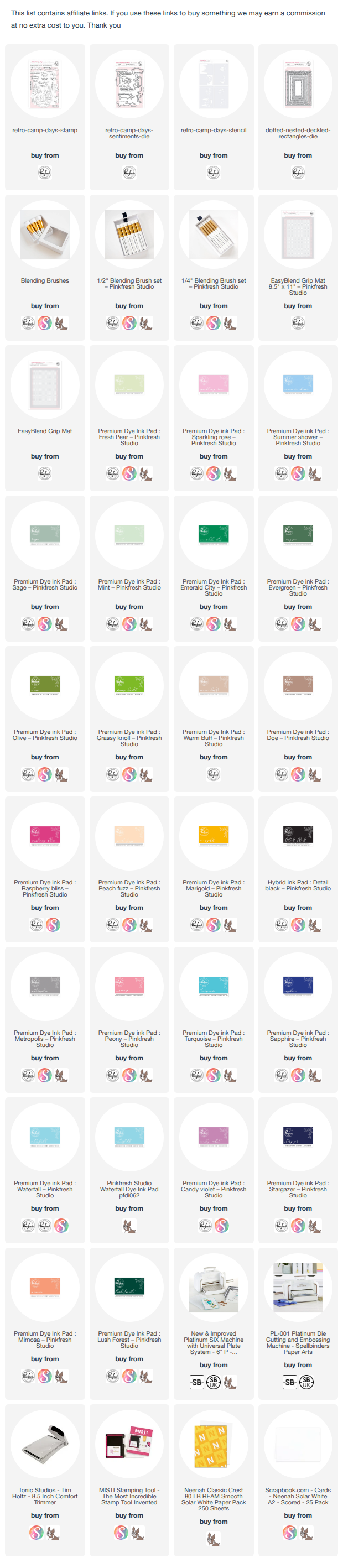
I've linked all of the products used below. If you enjoy scene-building cards and love experimenting with color, you'll definitely want to take a closer look at the Retro Camp Days collection. The images are detailed enough to create realistic scenes, yet versatile enough to support whimsical and imaginative color palettes too.
Thanks so much for stopping by today! Happy crafting and have a wonderful day!
64 comments:
LOVE your coloring on these! I am loving the florals in this release. The camper is cute, but my camping days are long past!
Hi!! Great inspiration. I especially love the pink trees!!! Very cute.
Ooh you have done this set proud with 3 uniquely different colour ways x
Ooh you have done this set proud with 3 uniquely different colour palettes x
This is my favorite set from this release! Love the colors of your cards--especially the pink trees!
VERY summery cards! This is the only way I'll do camping! Haha!
These cards are so unique and I like your colour choices to create such a different feeling.
This camper is adorable!!! Who wouldn't want to jump into this scene to relax? Great cards.
this is so great, reminds me of the old days when I was a kid, such a lovely scene. Adorable Isha!!!!
I LOVE the variety of examples you made of this darling camping scene!
I never thought I'd say this but I love the pink trees!!
Love this set, so much fun! Your colors are perfect, I can see this being used for all 4 seasons 😊
Great cards, Ishta! I especially love the nighttime version of your trailer seen. Just beautiful!
Beautiful cards showing the different moods that colors evoke. Lovely.
Wonderful inspiration, love all 3, so beautiful!
Those pink trees stole my heart ! Beyond beautiful
Wow Isha! Your cards are fantastic and really show how versatile this set is. I am particularly fond of the night camping scene!
Beautiful cards. I love love this Retro Camping. Thanks for the inspiration.
Your cards are AMAZING! They make me want to camp at your campsite! The color schemes you chose are absolutely beautiful…love the story they tell!
I want to be in this camping scene. I really want to go camping now!!!
Love this set.
This scene is awesome…and different.
The color on your florals is fantastic. I love the camper scenes.
Beautiful in 3 ways!
Your colorings are beautiful.
Love the scenes you created with the camper! Each color combo looks awesome! The Retro Camp Days set is a favorite! Great cards!
Wow each card was so awesome. I loved the color scheme on each of them, a perfect card for someone who loves the outdoors.
Beautiful scenes. Beautiful color combos used.
I love that you didn't just share cards but walked us through the impact of color. I think the night sky version is also my favorite. I want to be in that scene, cozy next to the fire and looking up at a sky full of stars. It's a beautiful spot. (I think this is also a sign that having more ink colors isn't a bad thing since it gives options for the type of scene I could create :)
Loving your outdoor escapes! Each card is its own adventure! Awesome!
Cute cards! I love the pink trees!
I love all 3 of these! It's great to see each one in a different time of the day! Fabulous!
You are spot on about using colors to set the mood-even when using the same images.
I love all the different color combinations! They are all so fabulous!
So many adorable cards with this one set! Each card has its own vibe and I love them all. In the mid-century world (of which I am a part....old gal here) these are called "canned hams"!!! Yours seal the show! Appreciate the inspiration!
Your color ideas are very inspiring to help us get out of doing the same things over and over. Great job Aisha.
I love this set and all the cards you created!
Beautiful retro retreat scenes-so bright and colorful! Love your nighttime starry sky!
All card names are so perfect to your descriptions! I learned art history in school, and my teacher told us, if you cannot describe what you paint, then your paint is not alive. And you described your cards colours in as a living picture, it is my first time blog hop and I enjoyed reading yours. Thank you.
Sorry forgot to put my name, Ashe Ostash and hope to win this set 🫶🏻
Marisela Delgado said: Gorgeous colors 💜 mariandmonsterd@yahoo.com
Great color choices and a nice way to show the different ways these stamps and dies can be used.
Beautiful work. The Retro Camp Days set is my favorite from the release
Love the different color palettes. Night one is my favorite!!
Charming, cozy scenes created with the retro camper set! Fab to see the variety of colors.
These new images are brilliant, Isha! I love your cards!!
Lori S in PA (US)
Very fun cards--love how you colored them differently, the look terrific!
I love how you walked us through the cards. This retro camper is so darn cute and the last card with the night sky is gorgeous!
This camper is my favorite from the release, and I love seeing all of your amazing color combinations.
Oh my oh my this release with the outside nature vibe is everything to me. Speaks to my everyday life. Need. And need
I love the glamping scenes! They look so peaceful.
I love the glamping scenes! They look so peaceful. I accidentally hit “publish” in the above comment before I added my name.
Oh my goodness! Such cute camper cards! I love them!
I love these! #3 is my favorite!
Wow! I love this set so much and the way you showed three examples of how to use it is so great. And the way you described each card was wonderful. I always loved using descriptive words in writing and you nailed it. They are all unique and so beautiful! Thank you so much for the amazing inspiration 💗.
I wasn't signed in on my comment above so I am commenting again to be sure to be added to the contest. Thanks!
Such fun camping scenes! I love the fun pink scene!
My favorite is the night sky version :) Beautiful ink blending on all 3.
luv these so pretty!!
I love all of your ideas for different colour schemes, Isha! I really like the night scene. This is such a cute set! Thank you for the inspiration!
Wonderfully unique cards!
Love the Pink trees.
Thanks for the inspiration.
Love your color combinations on the cards.
Love the camping theme.
Loving your coloring and the camper has yo be my fav. Love how you did these cards
Post a Comment